Applying for a Credit Card
Note: To comply with my Non Disclosure Agreement (NDA), I have omitted confidential information.

Location
UAE
Project Time
5 months
Project Brief
The client is a prominent bank in UAE who was in the midst of a Digital Transformation. They wanted to streamline and convert their manual credit card application process to a digital one. Their main goal was to increase market share and profit by providing better services to their customers.
My Role
I was involved in the design and research from May 2019 to October 2019 during which we did primary and secondary user research. It included benchmarking, user interviews and usability testing. I worked closely with another Product Designer, Art Director and Principle Designer to define the journey's experience, visuals and interactions.
We followed the Agile Methodology and worked in 2 weekly sprints. I worked alongside a Product Owner, 2 Tech Leads and a Front-end and Back-end team.
Discovery

Customer Journey Map

Service Blueprint
Empathy mapping & Crazy 8’s
Wanting to get the whole team involved we conducted an Empathy Mapping workshop with our stakeholders, product owners and developers. The goal of this workshop was to understand our users needs and create a shared understanding of those needs with the team.
Once everyone had an understanding about the user we conducted a Crazy Eights workshop. The goal here was to get the ideation process started and also understand what everyone in the team envisioned for the new journey.

Empathy Mapping Workshop

Crazy Eights Workshop
Mapping the as-is journey
To understand what happens on the customer side when they apply for a credit card, we created a customer journey map that helped us identify the highs, lows and opportunities that could be enhanced. Parallelly, we also created a service blueprint to map the bank employee actions and systems that are not visible to customers. To complete this exercise we spoke to 5 customers and visited multiple branches across UAE. We spoke to branch employees of each department and mapped out all the relevant steps in the application process.
The biggest takeaway from this exercise was that the current process was too long and completely paper based. It did not provide the transparency needed and required customers to go through repetitive steps.
Benchmarking
I reviewed the following 6 competitors to get a better understanding of other credit card application journeys in the market. I looked at their strengths, weaknesses and also analysed what features could be added to our journey.


.jpg)

Redefined User Problem
"Enable customers to apply for credit card via an faster end-to-end experience with continuous updates and tracking over mobile without any in-person visit"
Redefined Business Goals
-
Speed up the turn around time
-
Reduce number of bank staff involved
-
Increase market share and profit
Our Solutions
The new to-be journey
For the MVP we decided to target existing customers with and without a salary account in the bank. We made a preliminary flow and discussed it with all the stakeholders, product and tech teams to make sure it was feasible. Ultimately we settled on the flows below.


Choosing a credit card made easy

Problem
During interviews customers mentioned the difficulty they face when trying to figure out what card suits them best. Sometimes they would even go through all the details of the card and begin the application process only to realise mid way that they don't qualify for the card based on their monthly salary.
Solution
We added a screen that gave customers recommendations on what card to apply for based on their interested category and monthly salary. If they were not interested in the recommendation they could opt for viewing all cards offered by the bank.
Credit Card Need Need Analysis
Document submission made simple
Problem
Having to print and bring multiple documents to submit repeatedly while interacting with different staff members of the bank branch was a huge issue and hassle for customers.
Solution
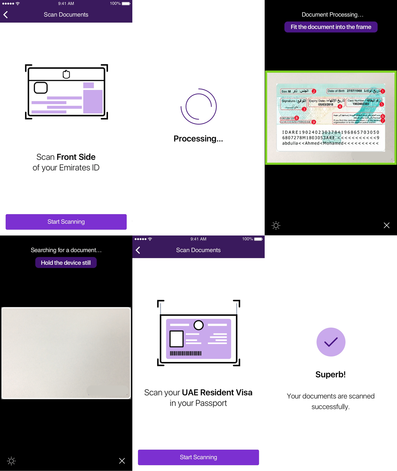
With the help of OCR technology we enabled customers to submit and verify documents real time on the app. The number of documents and their various uploading instructions was overwhelming the customers. Hence, we added information screens before scanning of every document to ensure they are prepared and do not feel rushed.

Document scanning on the app
Hassle free status tracking

Problem
The new application journey had 2 offline steps which meant waiting periods for the customer. During testing we discovered customers lost track of what step they were on and they also kept enquiring on what they had to do next.
Solution
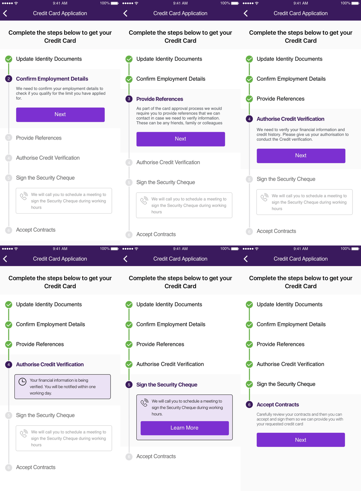
We created a vertical tracker that showed customers the whole application process in one glance along with descriptions for each step to ease any confusions or doubts. Additionally, if for any reason the customer dropped off they could resume the journey from where they had left off.
Credit Card Application Tracker
Results & Takeaways
The MVP results

Summary of the impact of the MVP
What I have Learned
1. How to create Service Blueprints
This was my first time creating such detailed service blueprints. It helped in visualising the relationships between the people, processes and the systems involved at every touch point thus helping us identify weakness and opportunities in the current flow.
2. Designing with an elaborate design library
The Art Director in the team created system library for the bank. As I started using it in to design my screens I was amazed at how much time I was now saving as I would not have to make components from scratch. Plus it also helped in making sure all the work across all squads was consistent for both the designers and developers.
3. Designing for a right to left script
The client was based in UAE therefore all our designs had to work well in Arabic. To make things consistent in both languages we mirrored all the screens and paid extra attention to how the text and icons looked visually and made sure everything was appropriate in both languages.